CASE STUDY · HEALTH & FITNESS

Pulse. A tracker that reads like a cockpit.

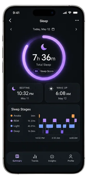
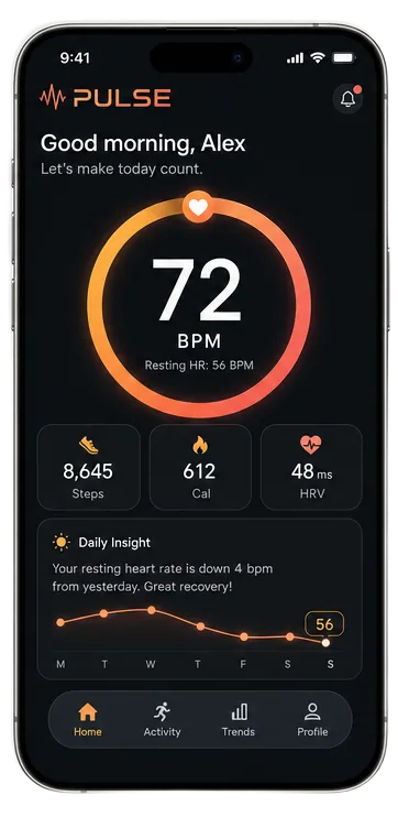
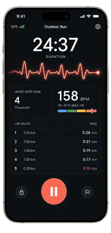
Sleep, heart rate, and live workouts. Health data that's actually fun to check, shipped as a native iOS app.

Pulse health and fitness app screen on an iPhonePulse app dashboard with live health metrics on an iPhonePulse app workout tracking screen on an iPhone
PLATFORM
iOS · Native Swift
INTEGRATIONS
HealthKit · Live Activities
TIMELINE
Set at kickoff, hit at launch
SCOPE
Design · Build · Launch

THE BRIEF

Health data people actually want to open

Most fitness trackers read like a spreadsheet wearing gym clothes. The brief for Pulse was blunt: make sleep, heart rate, and workouts feel like a cockpit, not a chore. Something a user checks because they want to, not because a streak guilt-trips them into it.

THE APPROACH

Design the glance, then the screen

We started from the three-second glance: what should a user learn before their coffee finishes pouring? That put the live metrics front and center, cut two navigation levels, and gave every number a shape. Trends became traces. Effort became color. The design system came out of those decisions, not before them.

THE BUILD

Native Swift, HealthKit deep

Pulse is native Swift with HealthKit wired through the core rather than bolted on. Live workout sessions, background sleep sync, and heart-rate streams all run on Apple's rails, which means the data is trustworthy and the battery cost is honest. A new TestFlight build hit the client's phone every Friday of the run.

THE SHIP

Kickoff to App Store, no drift

Six steps, one approved App Store submission on the first pass. Launch day was the midpoint, not the finish line: the analytics we wired in before release told us which screens earned their place, and the version-two scope wrote itself from real usage instead of guesses.

Your app could be the next case study.

Same six steps, your idea. Replies within 24 hours, usually faster.